The outcomes

Hand-painted letters traced with honey, photographed, scanned, and manually vectorized in Illustrator. The logo carries the imperfections of something literally made by hand.

AI-generated wordmark with a drop symbol featuring a curved S interior line — referencing oil and the brand name. Vectorized manually in Figma from raster output.
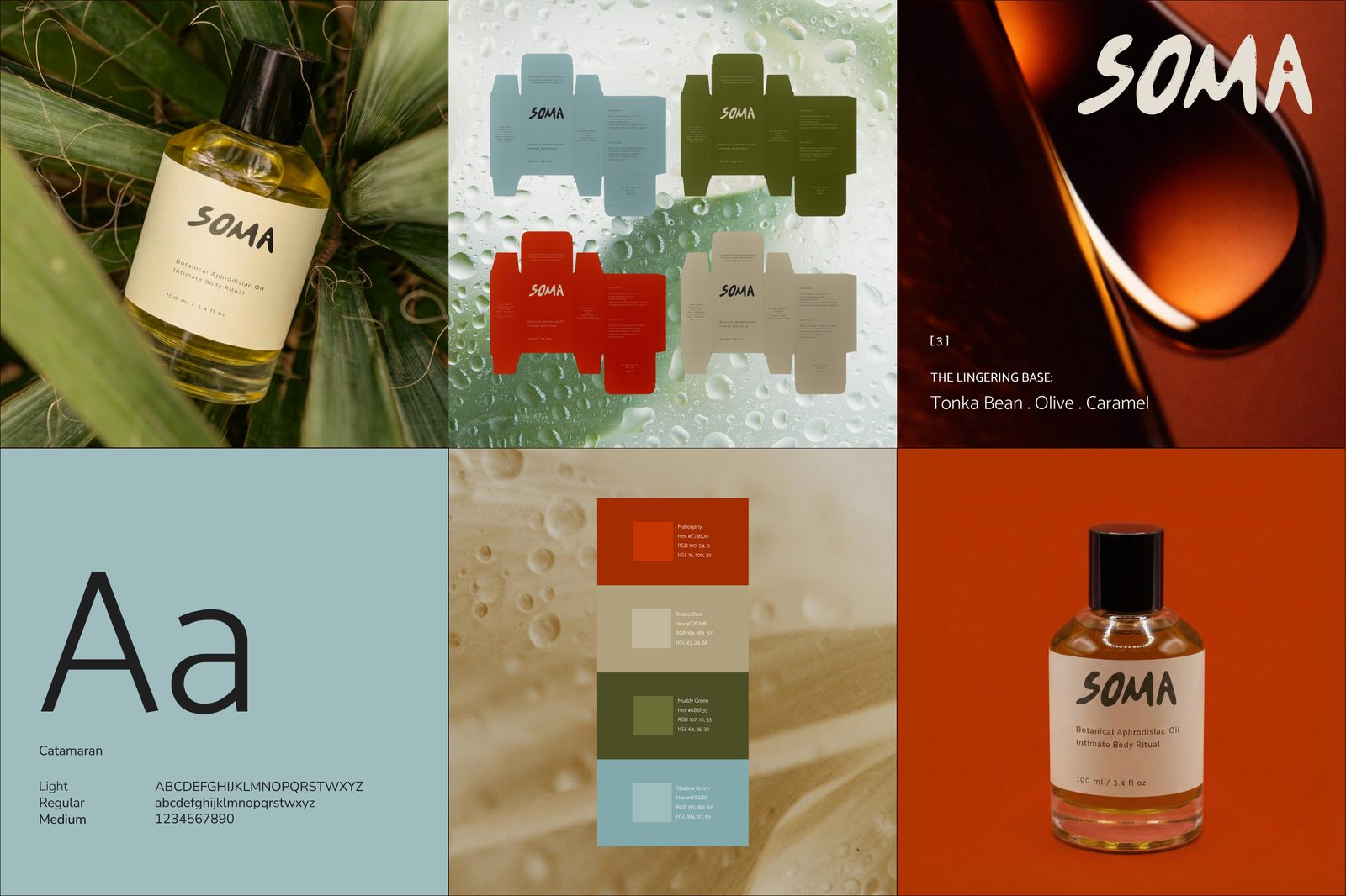
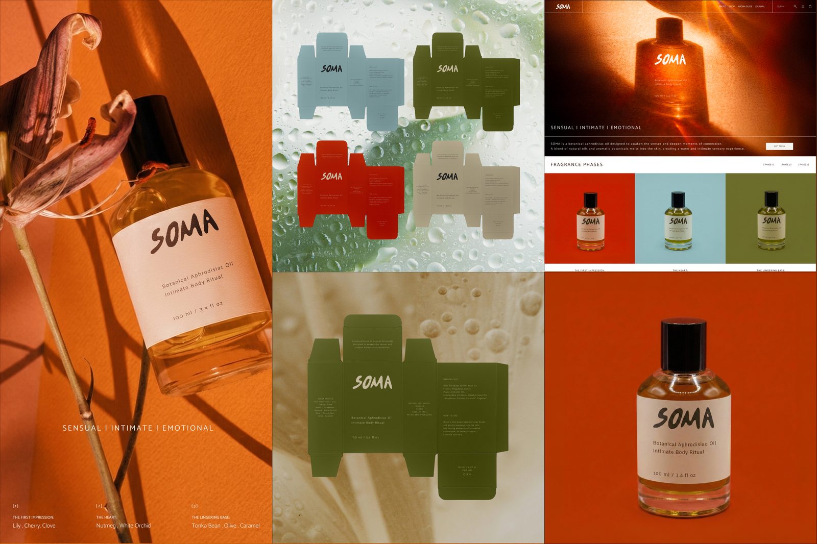
Earth tones grounded in real-world lighting tests. Hand-crafted typography with honey-traced lettering. A tactile, organic identity built through physical experimentation.
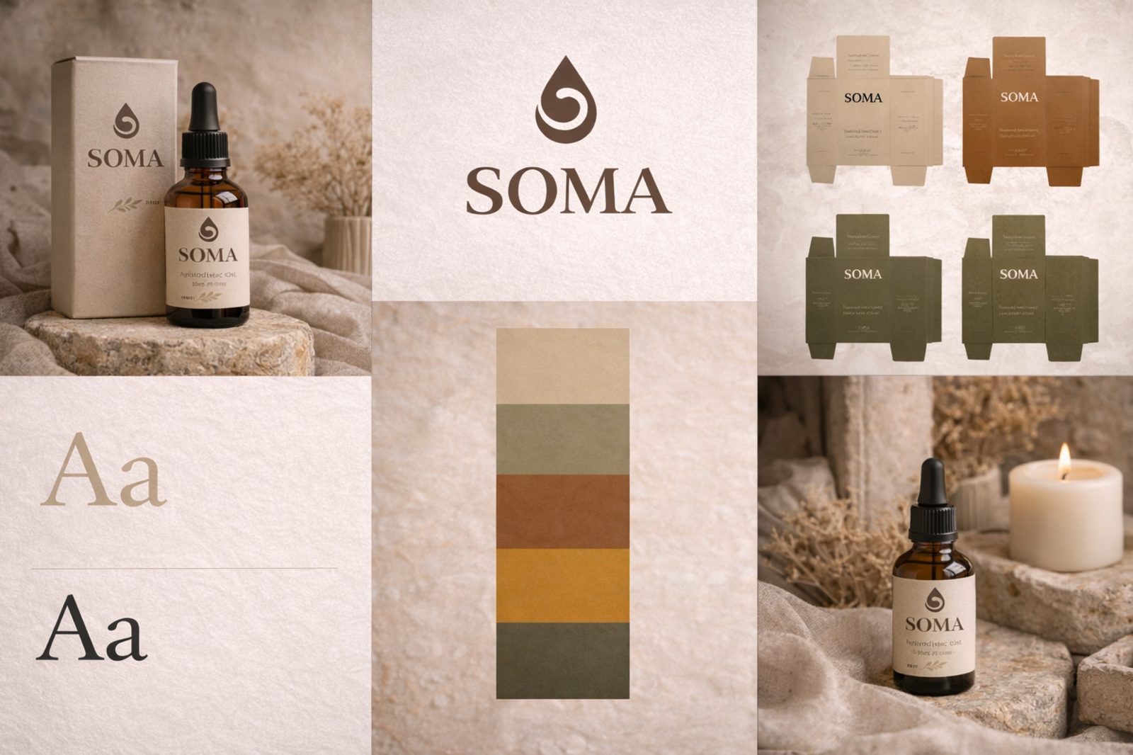
Moodboard-derived palette with Canela serif typography. A polished, cohesive identity assembled in minutes from AI-generated references and color extraction.
Photographed with two cameras and a mini light box. Composited in Photoshop to resolve physical constraints. Retouched and supplemented with human-made stock for tonal consistency.
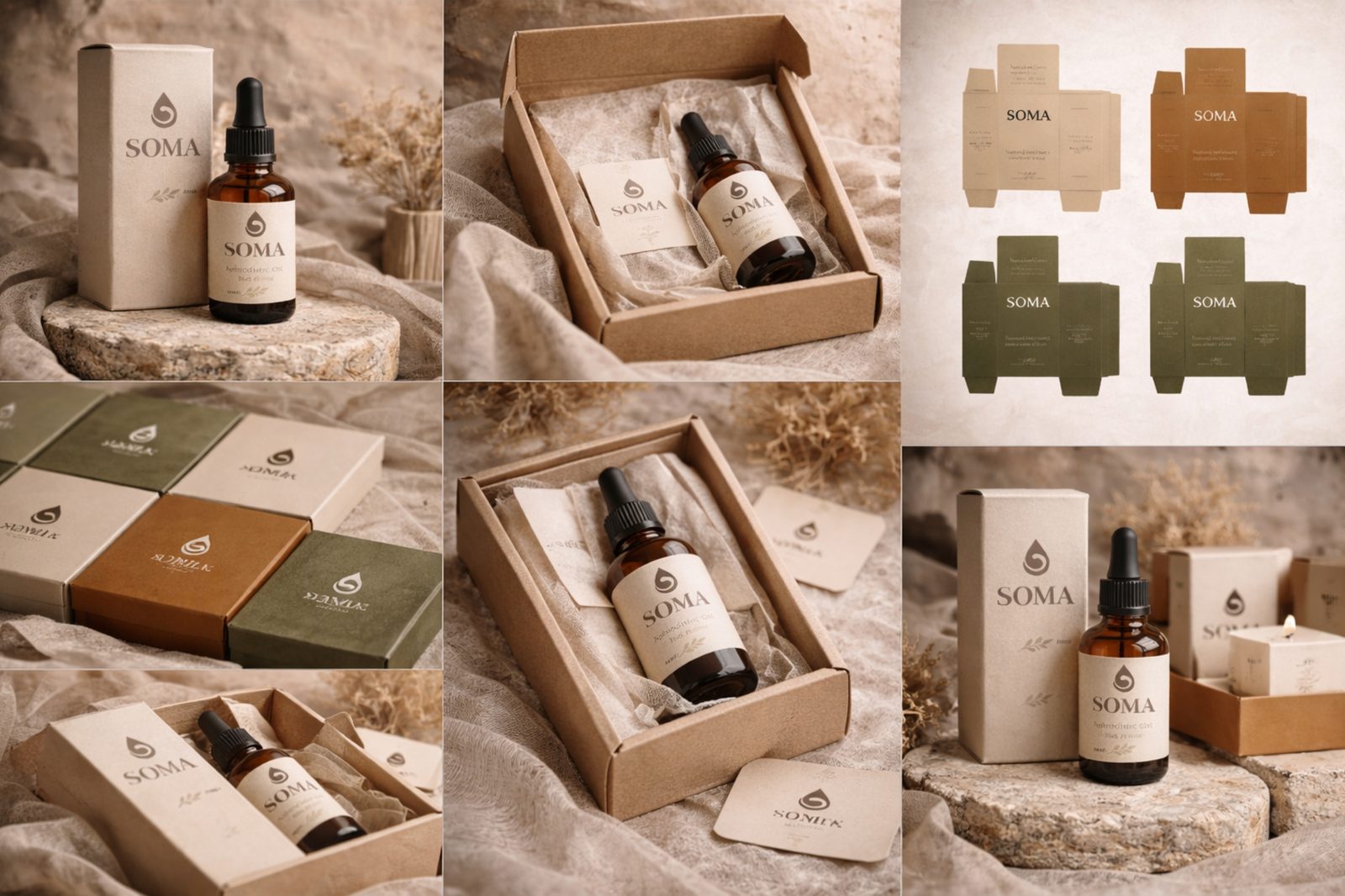
The strongest AI deliverables. Classic brown pipette bottles with an apothecary feel. Labels with readable text, serial numbers, QR codes, and ingredient lists.
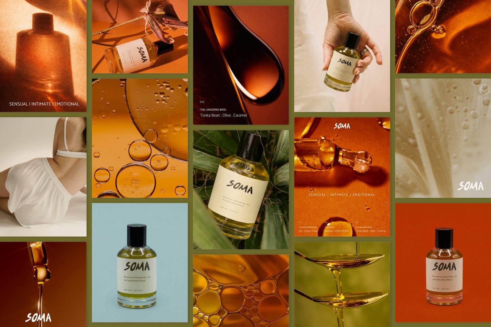
"Sensual | Intimate | Emotional"
Harnessing the quiet power of nature, we've created a sensuous oil that melts into the skin, nourishing you from the outside in. Our science-backed blends use organic botanicals to help you feel more present in your body, enhancing every moment of intimacy and touch.
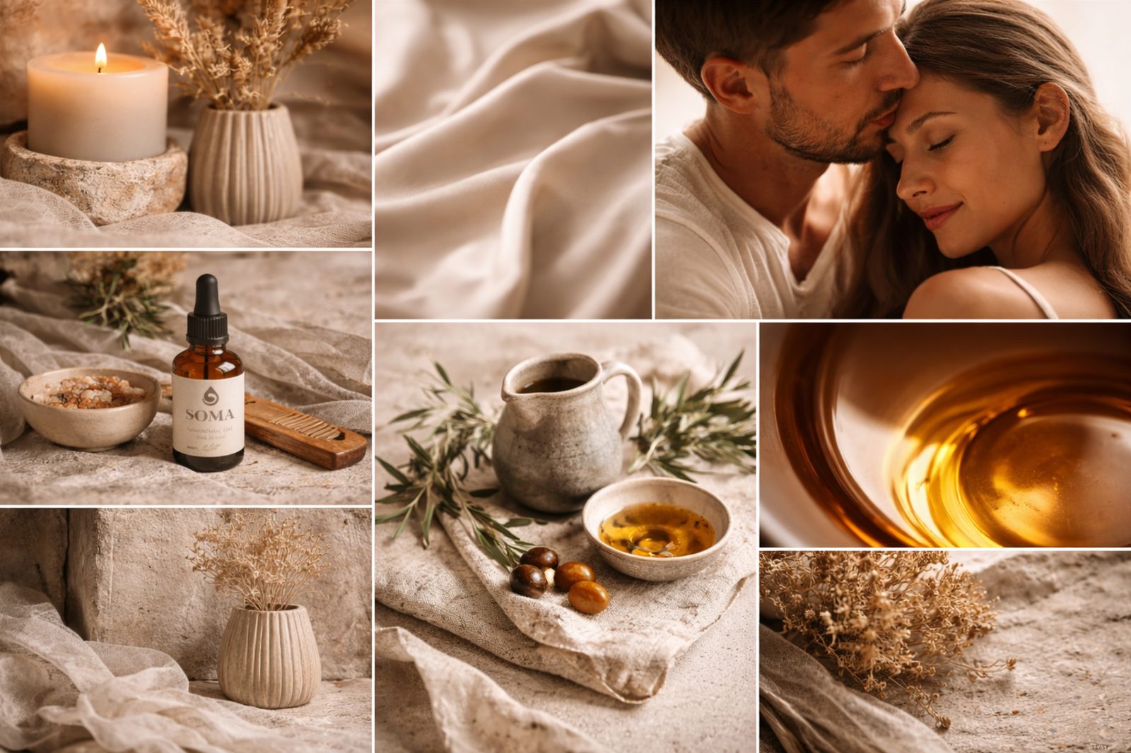
"Sensuality, simplified."
SOMA is a botanical ritual designed to slow the moment and reconnect body and mind. Crafted from nourishing plant oils and warm aromatic notes, the formula transforms everyday touch into an intimate sensory experience. The minimalist composition, soft textures, and earthy tones reflect a philosophy of quiet luxury — where intimacy is natural, unhurried, and deeply personal.